


Images are the heaviest thing on most web pages, and the hero image is usually the Largest Contentful Paint element that decides your perceived load time. Get image delivery right and you cut megabytes, climb the Core Web Vitals charts and lower your bandwidth bill, all without touching a line of application logic. This is the practical 2026 playbook: the formats that actually win, how to serve the right size to every device, and how to automate the whole thing so it never regresses.
Why image weight is the win worth chasing
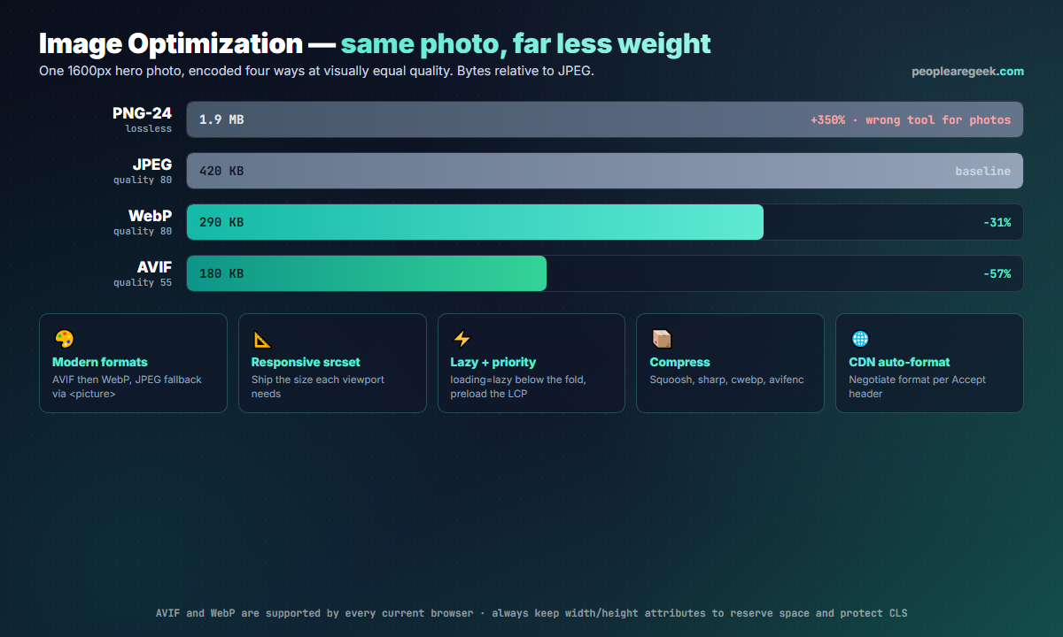
Open the network panel on almost any content site and images dominate the byte count, often 60 to 70% of total page weight. That weight maps directly to two things users feel: how long the main image takes to appear (the LCP metric, which Google wants under 2.5 seconds) and how much mobile data they burn. A 1.9 MB hero that should have been a 180 KB AVIF is not a rounding error; on a mid-range phone over a typical connection it is the difference between a page that feels instant and one that visibly assembles itself.
The good news is that image optimization is mostly mechanical. Unlike JavaScript performance work, which means profiling and refactoring, shrinking images is a repeatable pipeline you set up once. The five levers below compound: a modern format on a correctly sized, lazily loaded, well-compressed image served from a CDN can be a tenth of the bytes of the naive version.
Choose the right format first
Format choice is the highest-leverage decision, because a better codec saves bytes at every quality level. In 2026 the order is simple.
| Format | Use it for | Notes |
|---|---|---|
| AVIF | Photos, hero images, anything large | Best compression by far; slower to encode. Supported in all current browsers. |
| WebP | Photos and graphics, universal fallback | ~30% smaller than JPEG, fast to encode, supported everywhere relevant. |
| JPEG | Final fallback for ancient clients | Still fine at quality 75 to 82; use MozJPEG for a free 10% saving. |
| PNG | Logos, screenshots, anything needing crisp edges or transparency | Never use it for photographs; it is lossless and enormous on them. |
| SVG | Icons, logos, diagrams | Vector, tiny, infinitely scalable. Minify with SVGO and inline the critical ones. |
You do not have to pick one and abandon the rest. The <picture> element lets the browser choose the best format it supports and fall back gracefully:
<picture>
  <source srcset="hero.avif" type="image/avif">
  <source srcset="hero.webp" type="image/webp">
  <img src="hero.jpg" alt="..." width="1600" height="900">
</picture>
The browser reads top to bottom and uses the first type it understands, so AVIF-capable clients get AVIF, everyone else gets WebP, and the truly ancient get the JPEG in the <img>. Always keep that final <img> with its alt, width and height.
Serve a size that fits the screen
The second mistake after wrong format is wrong size: shipping a 2560px image to a 390px phone, which then downscales it in the browser after paying for every pixel. Responsive images fix this. Provide several widths and let the browser pick based on the viewport and device pixel ratio:
<img
  src="hero-800.jpg"
  srcset="hero-400.jpg 400w, hero-800.jpg 800w, hero-1600.jpg 1600w"
  sizes="(max-width: 600px) 100vw, 800px"
  alt="..." width="1600" height="900" loading="lazy">
The srcset lists candidate files with their real pixel widths, and sizes tells the browser how wide the image will actually render so it can choose before layout. Generate the variants automatically (see automation below) rather than exporting them by hand. As a rule of thumb, a 400, 800, 1200 and 1600px set covers phones through retina laptops; add a 2400px step only if you have genuinely large displays to serve.
Load the right images at the right time
Bytes you defer are bytes that do not block the first paint. Three native attributes do the heavy lifting, no library required.
- Lazy-load below the fold: add
loading="lazy"to every image that is not visible on first render. The browser skips them until the user scrolls near. - Never lazy-load the LCP image: your hero must load immediately. Leave it
loading="eager"and addfetchpriority="high"so the browser fetches it ahead of less important resources. - Preload the hero: for the single most important image, a
<link rel="preload" as="image">in the head (withimagesrcsetmatching your responsive set) starts the download during HTML parsing and reliably improves LCP.
Compress without visible loss
Once the format and size are right, compression quality is the last dial. The sweet spot is the lowest quality where you cannot see the difference at normal viewing distance, typically quality 75 to 82 for WebP and JPEG, and around 50 to 60 for AVIF (its quality scale is more aggressive). Free, reliable tools:
- Squoosh (squoosh.app) for one-off, eyeball-it-in-the-browser conversions with a live size readout.
- sharp, the Node library behind most build pipelines, for batch work.
- cwebp and avifenc on the command line for scripting.
- ImageMagick or MozJPEG when you are stuck with JPEG output.
# Batch a folder of photos to WebP and AVIF
for f in *.jpg; do
  cwebp -q 80 "$f" -o "${f%.jpg}.webp"
  avifenc --min 24 --max 30 -a end-usage=q "$f" "${f%.jpg}.avif"
done
Strip metadata while you are at it. EXIF data, colour profiles you do not need and embedded thumbnails can add tens of kilobytes per image; most encoders drop them by default, but verify with identify -verbose or an online inspector.
Automate it, at build time or on the CDN
Manual optimization rots. Someone uploads a 4 MB phone photo straight into the CMS and your scores quietly slide. Pick one of two durable approaches.
Build-time
If your images are part of the repository, transform them during the build. Frameworks make this nearly free: Next.js next/image, Astro <Image>, Nuxt Image and Eleventy Image all generate responsive AVIF and WebP variants from a single source and emit the correct markup. Under the hood they call sharp, so a custom pipeline is a small script if you are not on a framework.
On-the-fly CDN
For user-uploaded content, a transforming CDN is the cleaner answer. Cloudflare Images, Cloudinary, imgix, Fastly Image Optimizer and similar services resize and re-encode on request, negotiate the best format from the browser Accept header, and cache the result. You store one high-quality original and request ?width=800&format=auto variants. It moves the work off your servers and adapts automatically as new formats appear.
Protect layout stability while you are in there
Optimizing images is the perfect moment to fix Cumulative Layout Shift, the third Core Web Vital. Every <img> should carry explicit width and height attributes (or a CSS aspect-ratio) so the browser reserves the right box before the file arrives. Without them, the page reflows when each image loads and content jumps under the reader. It costs two attributes and is one of the easiest CLS wins there is.
Measure, then keep measuring
Confirm the work paid off and guard against regressions. Run Lighthouse (in Chrome DevTools or via npx lighthouse) for a quick lab score, WebPageTest for a filmstrip that shows exactly when the LCP image paints, and the Chrome User Experience Report or Search Console for real-world field data from actual visitors. Target an LCP under 2.5 seconds and a CLS under 0.1. Lighthouse will also flag specific oversized or wrong-format images, which makes it a useful checklist as well as a scoreboard. Wire a budget into CI so an oversized upload fails the build instead of reaching production.
<picture>, a four-width responsive srcset, loading="lazy" on everything but the hero, the hero preloaded with fetchpriority="high", generated by your framework or a transforming CDN, with width and height on every tag. That combination routinely turns multi-megabyte pages into a few hundred kilobytes.Frequently asked questions
Should I use AVIF or WebP in 2026?
<picture> element with a WebP source as the fallback and a JPEG in the <img>, so each browser takes the best format it understands. WebP remains valuable as the universal middle option and because it encodes much faster than AVIF.What is the best image format for website speed?
How do I optimize images without losing quality?
Does lazy loading improve performance?
loading="lazy" defers them until the user scrolls near, freeing bandwidth for what matters first. But never lazy-load your Largest Contentful Paint image, the hero people see immediately, because deferring it delays the very metric you are trying to improve. Lazy-load everything else; prioritize the hero with fetchpriority="high" and a preload.